Designing the Disneyland Paris Toll Plaza
For most people, the Disneyland Paris toll plaza is the entrance to a parking lot, but for Disney fans, it’s a lot more. It’s the gateway to the place we all know and love! That’s why it seemed appropriate for us to discuss the design of this iconic structure too.
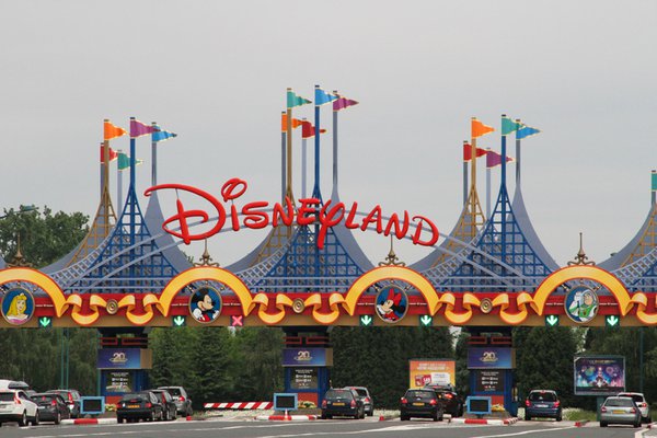
The toll plaza was designed and funded by The Walt Disney Company but it was built by the French Government (the Local Planning and Development Authority ‘EPA Marne’).
In designing the toll plaza, Walt Disney Imagineering had to take several functional criteria into account. They were provided input on the vertical clearance limits, the size of the booths, all point-of-sale and technical computer elements required inside each booth, as well as the number of car lanes to maximize capacity and streamline the flow of vehicles into two zones of parking.
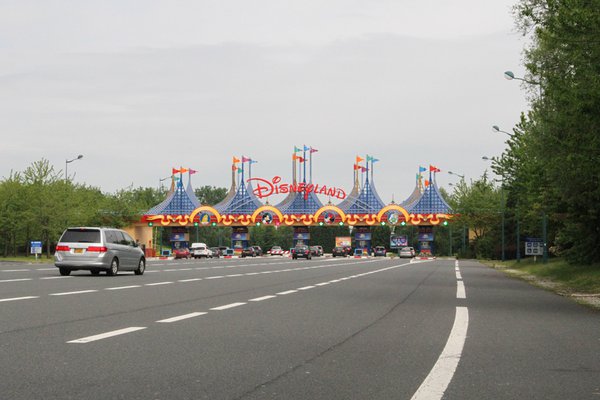
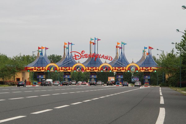
The toll plaza needed to have a large number of car lanes and toll booths to serve as many guests as possible at the same time. This resulted in a long, wide building. To balance the horizontality of the structure, soaring tents and flagpoles were added on top of it.
In order to create some depth, several tented shapes were placed behind each other. The foremost layers were given a grid-like structure and every layer got a different color.
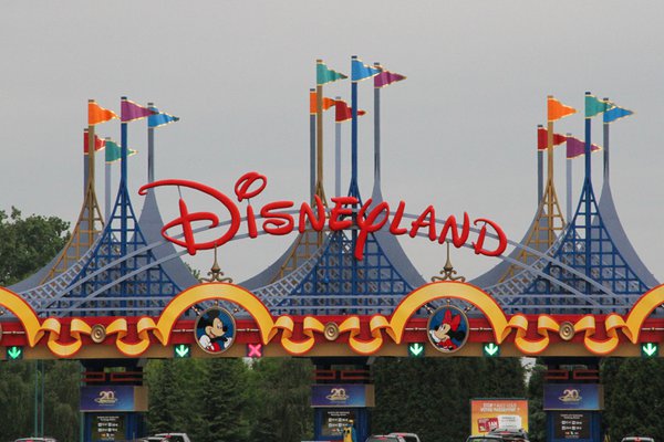
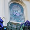
At the entrance to each lane of cars, Mr. Stuart Bailey, the team’s graphic designer, placed beautiful and artistic air-brushed, two-dimensional banners with an internally illuminated image of Sleeping Beauty Castle.
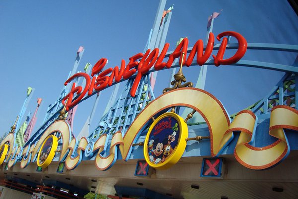
The toll plaza was originally painted in pinks, greens and blues. These bold sunny hues were selected by Disney Legend John Hench with a view to brighten up the dim French winter days. The use of pink was a reference to the color of the Disneyland Hotel that guests will pass underneath to purchase their tickets and journey onward into the Disneyland Park.
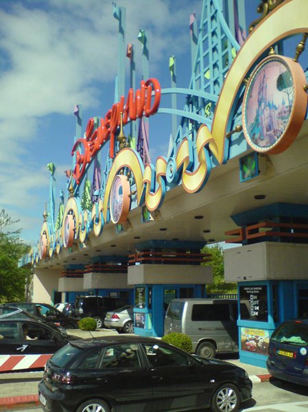
To animate the toll plaza, the Walt Disney Imagineers hung small colored aluminum panels inside the open spaces in the tented shapes using steel cable. They swayed gently with the changing breeze… until the winter of 2011 - 2012, when the toll plaza was given a new color scheme and the panels were removed.
We would like to sincerely thank Mr. Jack Perry (Senior Landscape Architect & Facility Design Manager for Euro Disney’s “Guest Entry Sequence”) for helping us to write this article. It has been published in loving memory of Guest Entry Sequence Show Producer, Mr. Eric van Dyke.
Credits
Photos Nr 1, 2, 3, 4, 7: Bert Snyers
