Designing Fantasyland – Fantasia Gelati
“Fantasia Gelati” is an ice cream parlor in the Italian section of Fantasyland at Disneyland Paris. It’s located next to the “Pizzeria Bella Notte” restaurant. According to Walt Disney Imagineer, mister Tom Morris (Show Producer, Fantasyland, Disneyland Paris), the ice cream parlor was called “Fantasia” because it’s a name that translates across languages, it sounds fun, it suggests a frenzy of flavors and it has a connection to a Disney film.


The structure was designed by Walt Disney Imagineering architect, mister Ron Bowman. Its façade has been painted in pink and cream colors because that visually suggests “ice cream”.

The Imagineers made the right side wall look a bit weathered to give Guests the impression that the building has been around for quite some time.

The roof received a copper finish to give it a traditional appearance and to make it last over time, considering the sometimes harsh weather conditions in the Paris region.

The light fixtures have been designed after ice cream cones. This visual “gag” prevented Imagineers from having to explain in several languages what the place is all about.

The “Fantasia Gelati” ice cream parlor shares textures and colors with the “Pizzeria Bella Notte” restaurant to make sure that both buildings blend well. The checkerboard pattern is, for instance, not only suggestive of certain Italian ice creams (like Neapolitan) but also a reference to the neighboring pizzeria that features Venetian architectural elements as well.


The layout of the ice cream parlor was determined by Walt Disney Imagineering interior designer, mister David Brickey and the Euro Disney Food Division. The floor pattern features a “threshold stripe” that acts as a dividing line between the outside and the inside.


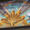
The counter was originally decorated with wood lattice. But soon after the opening of the Park, it was covered up with a mosaic to provide for a more durable surface.

The clouds above the counter enhance the fantasy setting, create a three-dimensional, “multiplane” effect and hide things that are not part of the theming.


The climbing plant is reminiscent of wisteria and is there to add a touch of fantasy and to tie the background mural in with the foreground elements of the counter area.

The mural features imagery from the “The Pastoral Symphony” scene from the animated film “Fantasia”. This particular scene was selected because it’s a pleasant one to look at and it never got a lot of exposure in the Disney theme parks. The creation of the mural was supervised by resident character expert for the Euro Disney project, mister Steve Cargile.


The design of the door that leads to the backstage area is based on Greek and Roman forms to tie it in with the mural. The clouds on the ceiling serve as a sort of continuation of the mural. It’s also a motif that can be found throughout European architecture. The ceiling features skylights as well. They used to be transparent. But shortly after the skylights were installed, a visual intrusion was discovered and the Imagineers quickly frosted them.


We wish to thank Walt Disney Imagineer, mister Tom Morris for his kind and much appreciated assistance in writing this article!


