The Evolution of Euro Disney’s Hotel Area
In previous articles, we told you that several Southern Californian companies had been involved in the planning and creation of Euro Disney. Sussman & Prejza came up with a corporate design, PBR Inc. laid out the entire property and Sasaki & Associates did the extensive landscaping that was needed to articulate the former beet fields.
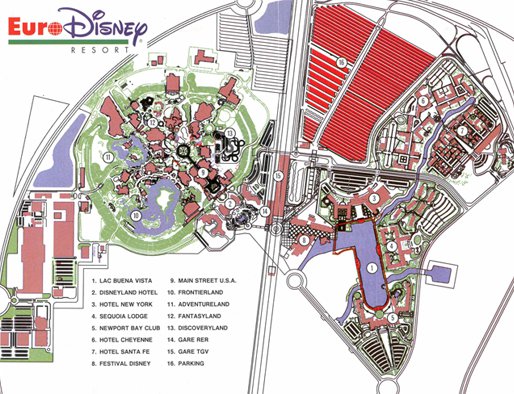
We also stated that PBR’s master plan is very close to what was built so far… but it isn’t exactly the same. Today’s so called “resort area” (encompassing the transportation hub, entertainment center and hotels) has a totally different lay out compared to what can be seen on the master plan. How come, you might wonder. What caused this change? Well, you’re about to find out!
PBR is a development consulting firm specialized in suburban town planning.
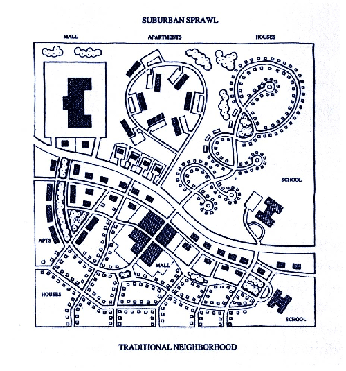
In a modern suburban town, land uses of the same type are grouped together. Retail shops are concentrated in one zone, apartment buildings in another. These zones are separated by open space, infrastructure or other barriers. As a result, the zones are far from another, usually to the extent that walking is impractical. So people have to get in their cars to go out shopping.
In a traditional urban town, land uses are blended together. Apartment buildings can be found adjacent to retail shops. Because functions are physically and functionally integrated, people don’t have to travel far to get to the shop. They can walk to places and don’t need a car.
The following drawing perfectly illustrates the aforementioned difference. The area to the south of the “Collector Road” is an example of traditional urban town planning. The area to the north of the “Collector Road” is built in a modern suburban fashion.
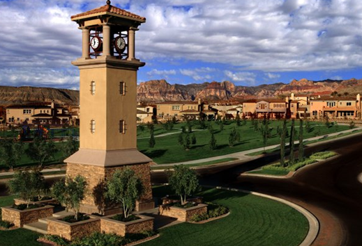
Summerlin (Las Vegas Valley, Nevada, USA) is a neat example of a modern suburban town. Residential districts can be found in its center. Shops are located in the east and west parts of town. Because both zones aren’t interconnected and there is a huge distance to travel between them, people are encouraged to take their car to go out shopping.
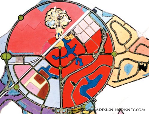
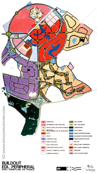
PBR laid out Euro Disney in a suburban fashion as well. Upon close examination, one might notice that the master plan contains all the characteristics of a modern suburban town.
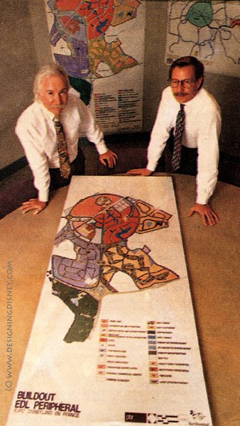
The area inside the circular boulevard was divided in three zones: one for the theme parks (pink), one for the resort center (red) and one for an office & industrial park and a regional shopping center (pale blue). The resort center was split up in several plots each holding a hotel.
All zones / plots weren’t interconnected forcing people to travel long distances to get to the theme parks and the neighboring hotels.
It was this suburban and car-oriented master plan that Robert A.M. Stern came across while visiting the Walt Disney Imagineering headquarters in March 1988.
Robert A.M. Stern is a famous architect who designed (i.a.) the Disney Casting Center in Orlando, the Disney Headquarters in Burbank and Disney’s Beach Club Resort in Walt Disney World. Like many other postmodern architects, Stern rejects the planning concepts of suburbia. That’s why he didn’t like the suburban character of the layout PBR came up with for Euro Disney’s resort center.
During his visit to the WDI headquarters, he commented that “the plans [for the resort center] looked like a subdivision in Orange County California” (Dunlop 1996: 147), “an American subdivision in the French countryside” with “big areas for the hotels [and] all kinds of roads by very little integration of the parts”. He concluded that “it’s very suburban” (Eisner 1998: 278).
For Stern, it was important that Euro Disney’s resort center wouldn’t be suburban because he knew that Europeans are into walking and sophisticated in their design expectations.
Stern’s negative feedback was immediately taken to heart. The Walt Disney Company – and Michael Eisner in particular – was very sensitive to criticism on their European project. They intended to create a world class resort destination that could easily compete with the castles and monuments of the old continent and one of the most beautiful cities in the world: Paris. Disney also considered Europeans as highly educated and refined and wanted to make no design mistakes.
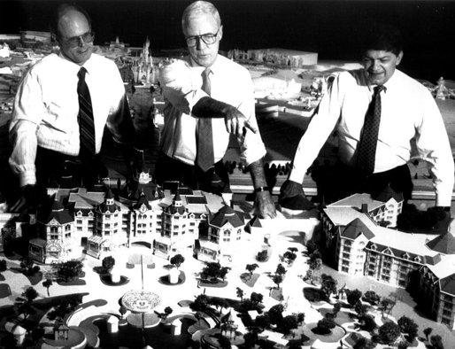
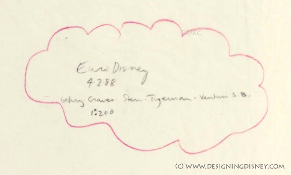
That’s why Stern and Wing Chao – the then chief architect of the Disney company – were asked to take all necessary steps to change and improve the layout of the soon-to-be-built resort center. They hastily invited a group of leading post modern architects (Michael Graves, Frank Gehry, Stanley Tigerman and Robert Venturi) to criticize the original ideas. Over the Easter weekend of 1988, they came together and brainstormed about a new site plan.
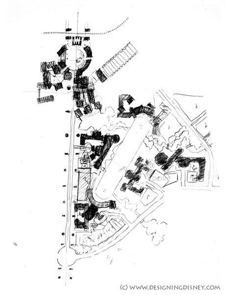
On (Easter) Sunday, April 3, 1988, a new (traditional urban) layout for the resort center was found. The architects decided to organize the hotels (and entertainment center) around the formal and central “Lake of the America’s” (later called “Lake Buena Vista” & “Lake Disney”) and several meandering rivers and lagoons. A coherent network of pedestrian walkways and the limited distance between the sites would encourage guests to go to the parks / their rooms by foot.
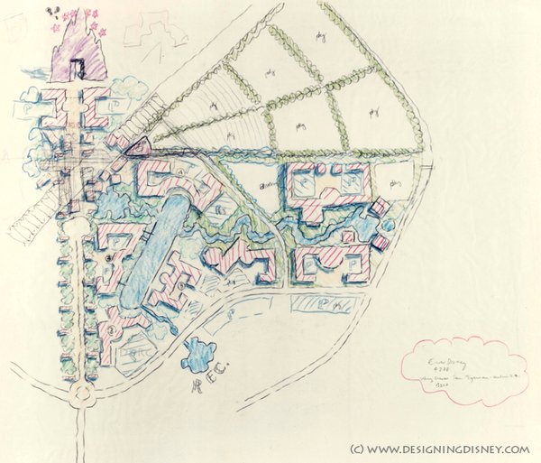
So yes, indeed, PBR’s (suburban) master plan is very close to what was built so far. But spurred by the royalty of postmodernism, today’s resort center looks different compared to what was envisioned by the development consulting firm. The unique collaboration of the world’s leading postmodern architects resulted in a marvelous site layout (for the resort center) where people don’t need a car (bus or taxi) to get around. They can simply go by foot.
And still today, this a key feature (and selling argument compared to the partner hotels located outside the circular boulevard) of the Disneyland Paris resort area!
This article was written by our good friend Will. His fascination and appreciation for Disney started with the opening of Euro Disneyland in 1992. Coming from an American Cultural Studies background, Will today is most interested in the original concept of the Euro Disney Resort and the cultural messages that the Walt Disney Company wanted to convey about the United States back in the late 1980s. To Will, the 1992 Euro Disney complex is an outstanding example of postmodern architecture and culture, which should be maintained in and reconstructed to its original state as closely as possible. These concerns and interests lead the author to follow and support 'Designing Disney'. We would like to sincerely thank Will for the efforts that he has made in writing this very interesting article!
